Ferro Coffee Roasters
An identity for a roaster opening forty cafés
One roastery became a national chain. The brand had to scale from a single chalkboard to forty storefronts.
Client
Ferro Coffee Roasters
Sector
Hospitality
Year
2024
Duration
14 weeks
40
locations rolled out
Scope of work
Brand identity, Packaging, Environmental, Art direction
The write-up
Written by the people who did the work, not a marketing team.
Ferro started as one roastery in Porto with a chalkboard menu and a following. Investment took them to forty locations in under three years. The chalkboard did not scale.
Keeping the hand in it
The brief was to industrialise without sterilising. We kept the hand-lettered origin, but redrew it as a typeface — one weight, forty-two ligatures — so any café manager could set a new menu without hiring a signwriter.
The system
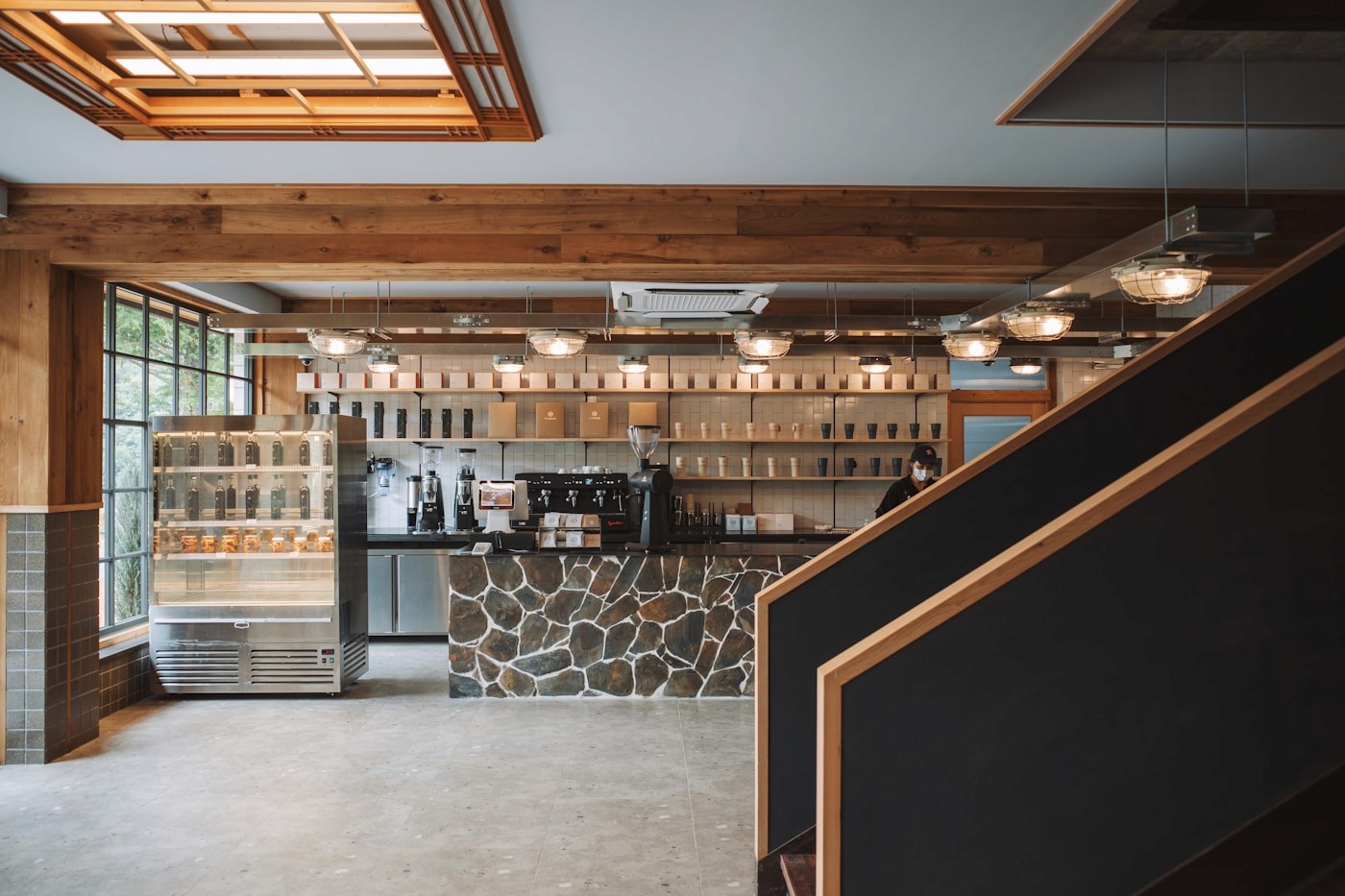
Packaging built on a single label architecture that carries eleven origins without a redesign. An environmental kit with three storefront types by footprint. A photography direction that a local shooter can follow from a two-page brief.
Result
Forty locations opened on the system with no central design team. Ferro’s marketing lead reports the brand guidelines are used weekly rather than filed once.